Statements & Activity Redesign
UX Design
Visual Design
Strategy
Product Manager
Scrum Team
Business Partners
Compliance

Analytics Data
Impact
+14.8M Active Users
+2.4M Downloads
+4.7 times Login
Strategic Objective
Problem Statement
How could we redesign the Statements & Activity experience to empower customers to utilize, access, and manage their financial activity through improved discoverability and accessibility?
.png)
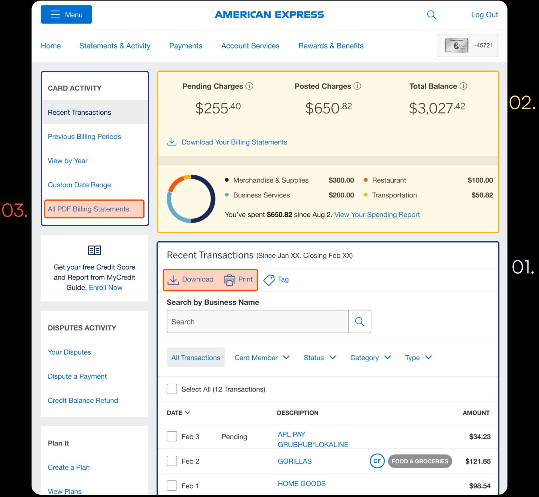
Final Design
Solution
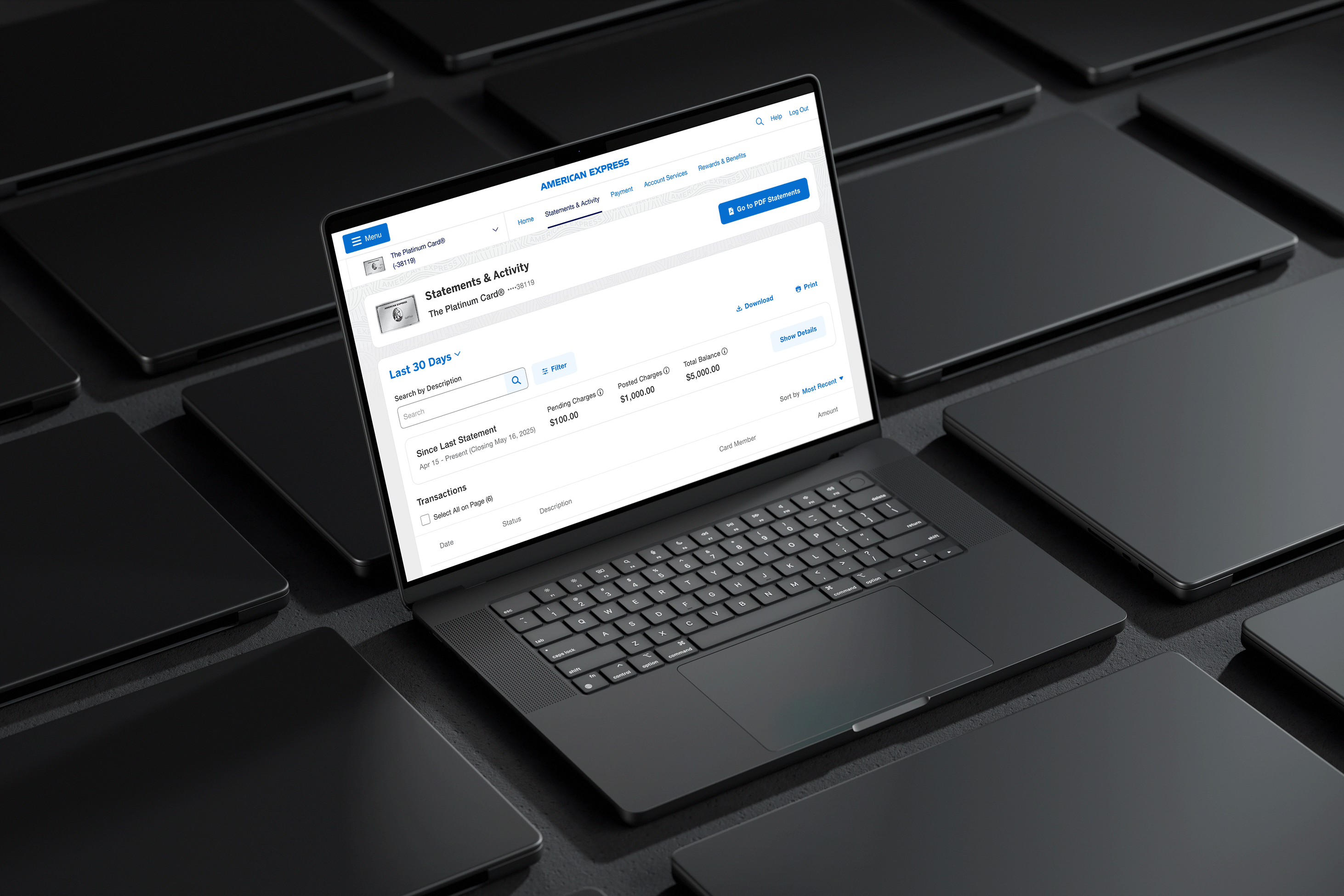
Full-width design shifts the focal point back to transactions and hide secondary content with progressive disclosure
.png)
Final Design
One Component -> Big Impact
Reusable components were built along the way, serving as foundational building blocks for other journeys to implement and scale consistently across the product.
Final Design
Progressice Disclosure
Use of Progressive disclosure - better breakdown of information
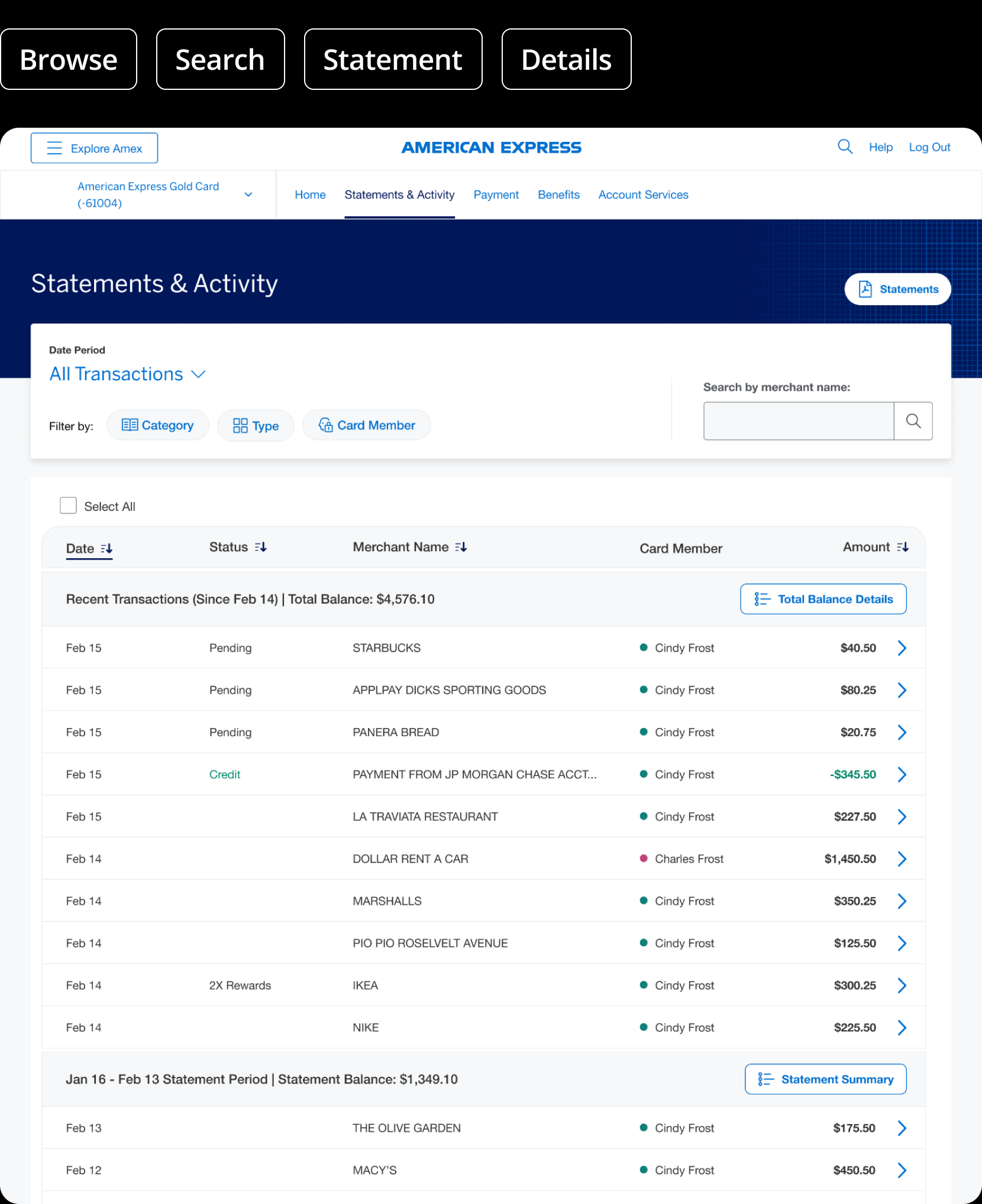
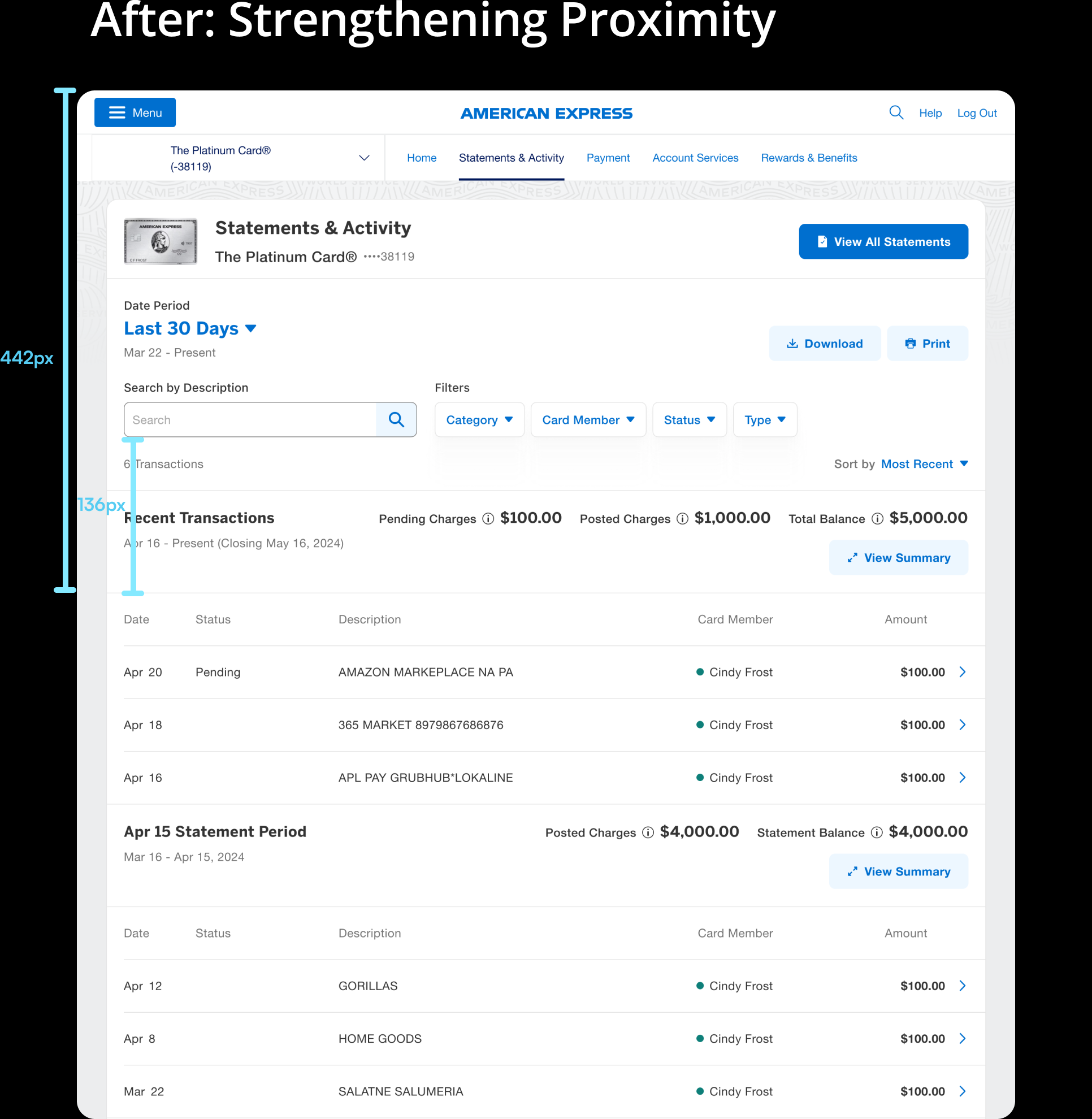
Before Redesign
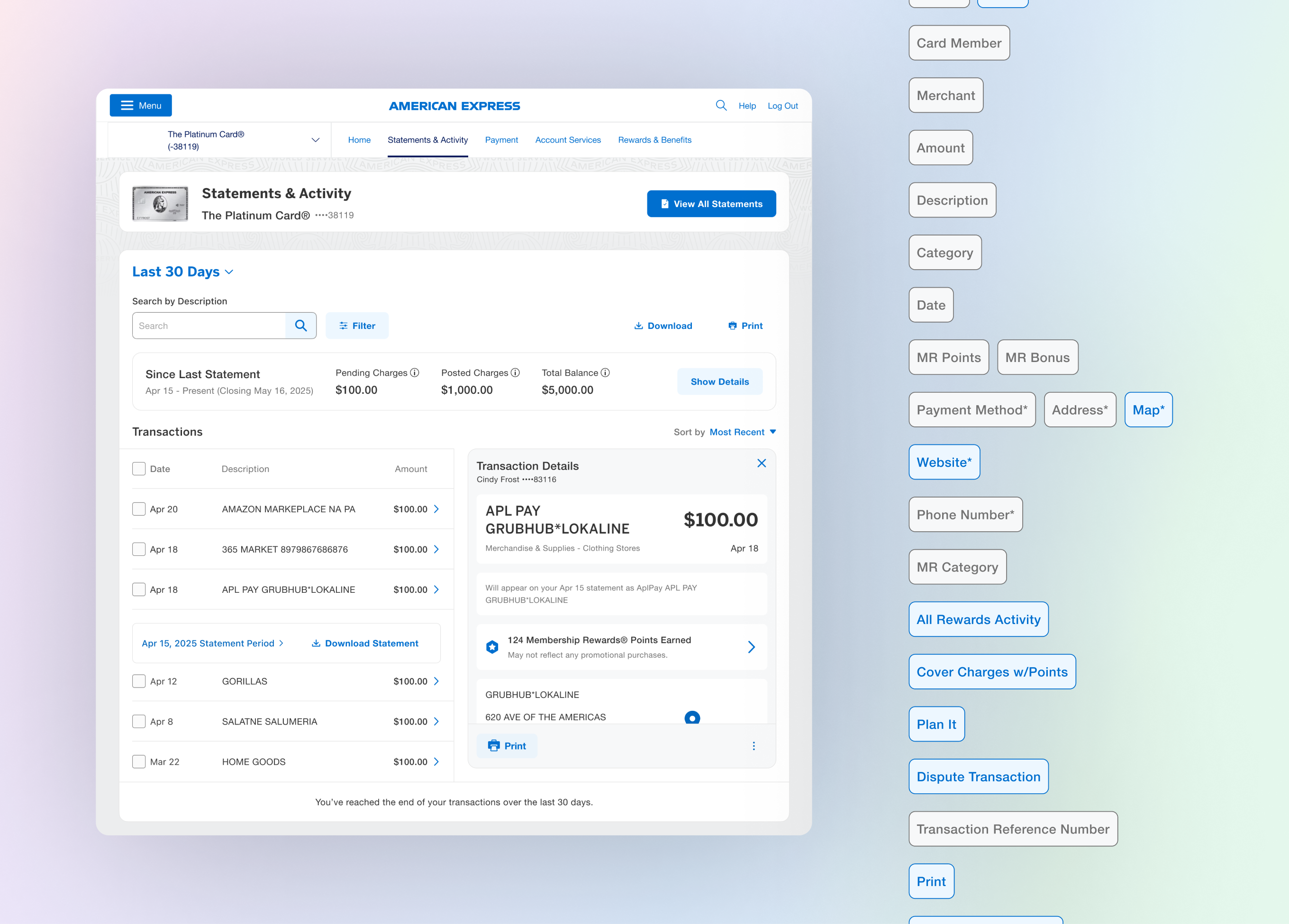
Customer Experience Problems
01. Poor findability for critical transactions functions
Cardmembers struggle to find critical info pertaining to transactions. For example, search & billing period selection are disconnected from the list of transactions.
02. Overly prominent Balances and Your Spending Report causes visual hierarchy and user intent misalignment
The Balances and View Spending Report sections hold too much visual prominence in the Statements & Activity tab, making it harder for users to quickly locate and focus on their Transactions, which is likely their primary intent.
03. Low discoverability for statements
Customers express difficulties in discovering statements, including: viewing, printing, and exporting functions. Currently, Ineffective placement and lack of visual cues to the All Pdf Billing Statements page and actions buttons (download, print) reduces visibility.
Workshop Outsome
Focus on the Core Missions
Our concepts were centered around the core missions that we identified during a workshop with designers, product partners, and engineering collaborators.
01. Browse and navigate transactions & statements
02. Search for a specific transaction or statement
03. View details of transactions
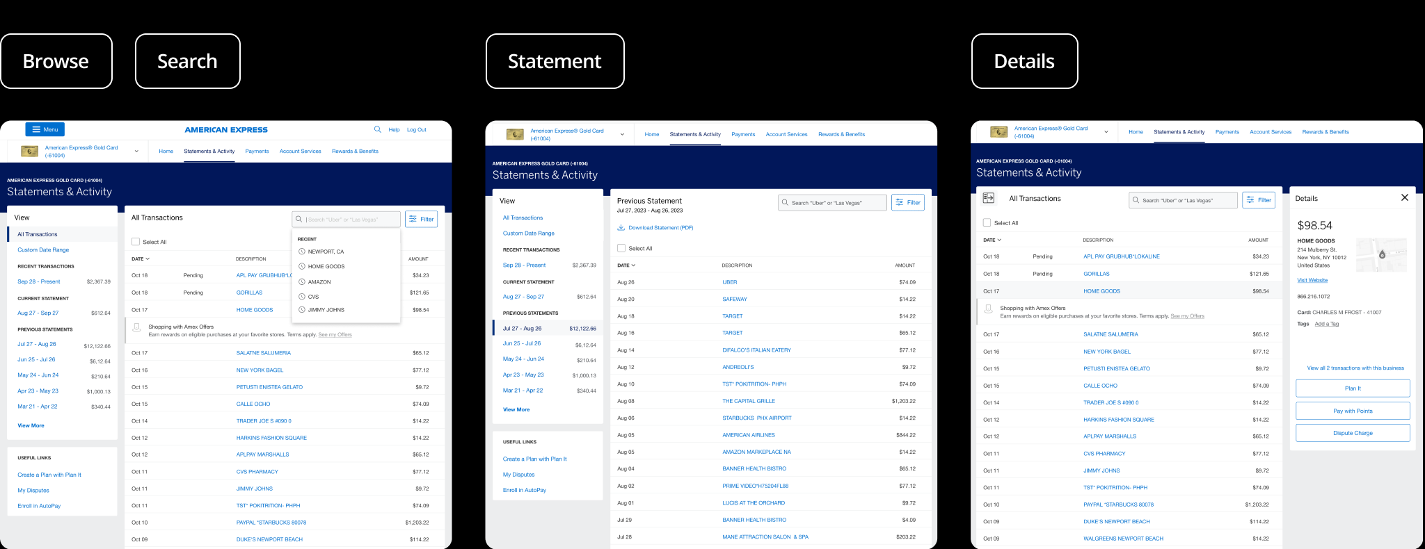
Design Concepts
Glimpse of a Dream
We brought our vision to life with three lo-fi design concepts, each offering a unique way for users to scan their transactions, search for specific transaction and download statements.
Design A - Side Panel
This design concept provides more real estate for transaction details, making key tasks easier to complete. Statement actions are clearly surfaced within billing cycle panels, and secondary content is separated into a dedicated space to prevent overcrowding and visual saturation.
.png)

Design B - Full Width
This concept elevates statements to a top, prominent position on the page, removes left-rail navigation for a cleaner layout, and connects transactions directly to high-value actions above. It also separates the total balance from the transaction summary for improved clarity.
Design C - Merged IA
This concept merges the Dashboard with the Statements & Activity page, making the activity feed a central focal point while leveraging existing account vitals from the dashboard for a more unified experience.

User Testing
Validation of Key User Goals
We refined the ideas and selected two concepts for testing. Both concepts were evaluated with 5 participants, focusing on the key tasks. These tasks stemmed from the core missions, primarily centered on browsing and searching through transactions and statements, as well as reviewing transaction details.
Design A - Side Panel
Design C - Full width
1. During user testing, Participants neither noticed nor missed the absence of balance information. They valued the emphasis on transactions, specifically noting that their primary goal was to review their transactions.
2. Users tended to scroll and search to find specific transactions they were looking for. It was important to optimize scroll on the next design iteration.
3. On Design concept A, Users felt the balance information in the side navigation was particularly cluttered and confusing, especially due to how it was divided between recent transactions and the current statement.
Overall, Users performed well and scored higher on the completion rate for design concept C. Concept C was our clear winner, and we decided to develop the concept further according to user feedback.
User Testing II
Feedback Loop
After our first user testing session, We responded promptly with iterative design and prioritization for our MVP release. Before we delivered our features, We wanted to revaluate our task completions because there has been significant design changes along the way.
User Testing Round II repeated the same tasks given for the first user testing. The tasks were also based off of the core missions involving browsing transactions, searching transaction, downloading statement, and viewing details of transaction. All 5 users were able to complete the tasks (User completion 5/5) for all 4 tasks.
Visual Design
Design System Uplift Challenges
One of the key challenges during the project was aligning our redesign with the new DLS 7 design system, which was still evolving in parallel. While the uplift aimed to modernize visuals and improve consistency across the platform, it introduced limitations in components and subtle structural shifts.
The updated visual rhythm also changed how users scanned and processed information. For example, increased padding and larger type sizes improved readability but weakened percieved relativitiye of contents. This spacing unintentionally created a disconnect between the search input and filters from the data table they controlled, reducing their perceived association and making the experience feel more fragmented.
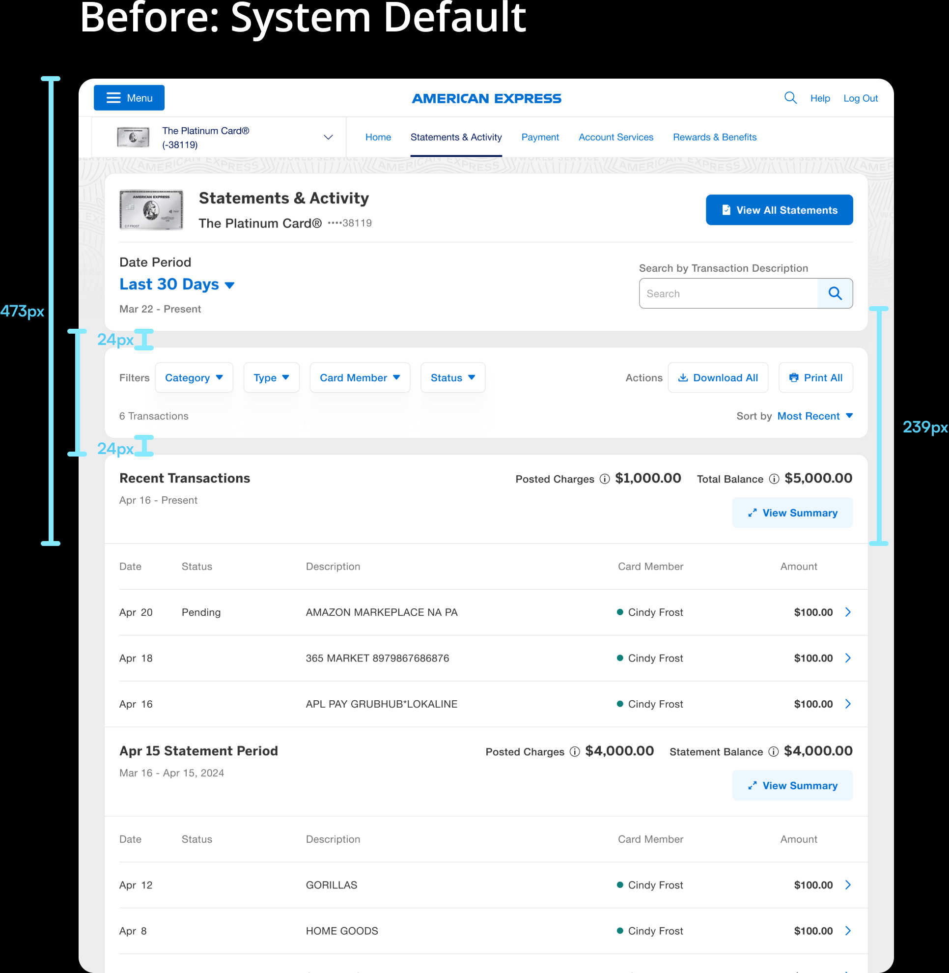
We reduced the spacing between the search, filters, and transaction table to improve visual grouping and reinforce their relationship. This tighter layout made the interface feel more connected and intuitive, helping users understand that these controls directly impact the data below — all while staying aligned with the design system’s intent.
Visual Design
Iterative Refinement Roadmap
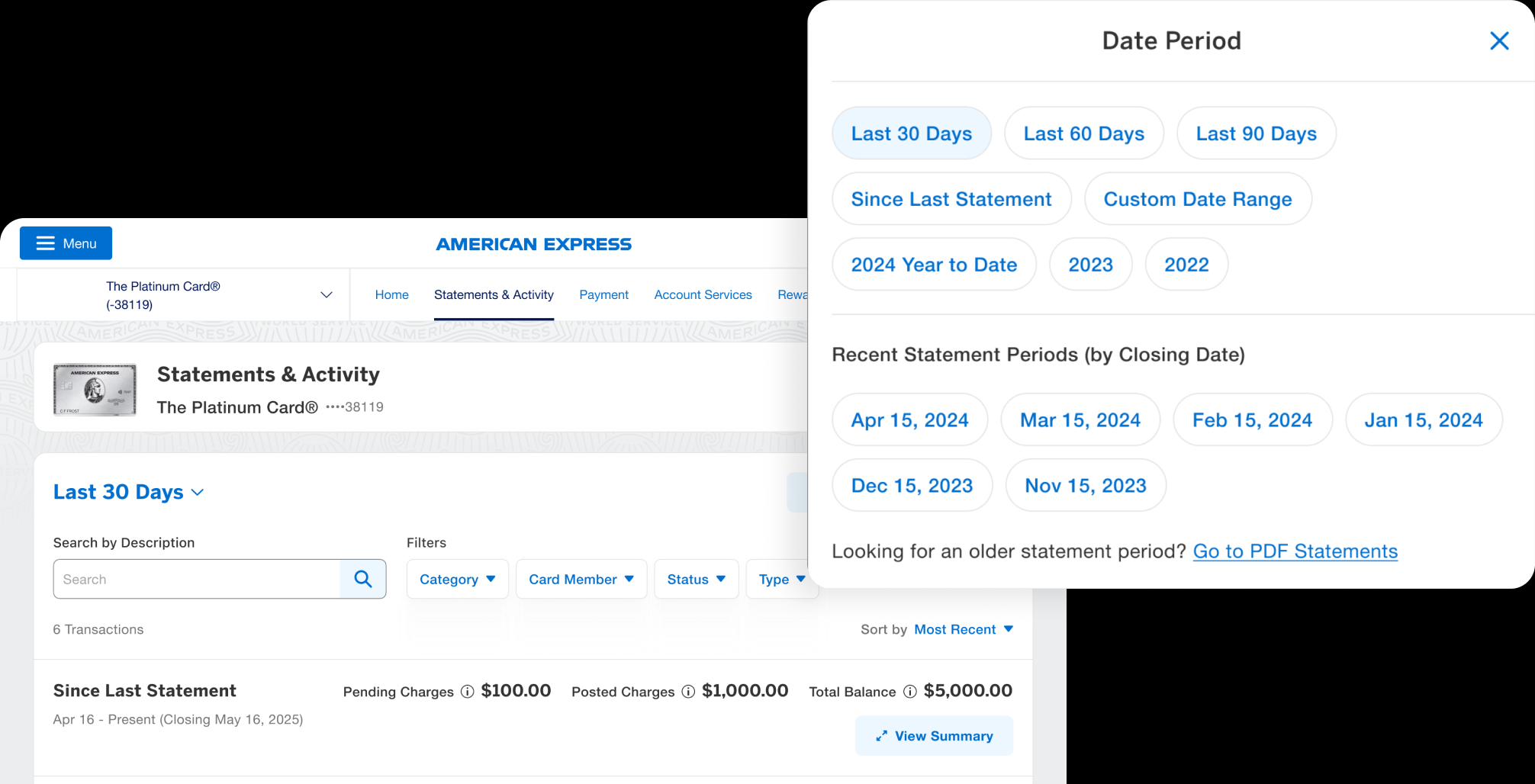
Step 1: Improve Time Controller
Improved the time controller’s clickability by separating it from the top card art and refining the date picker copy to clearly distinguish between recent activity periods and older statement periods, guiding users back to PDF statements for dates no longer available in the interface.
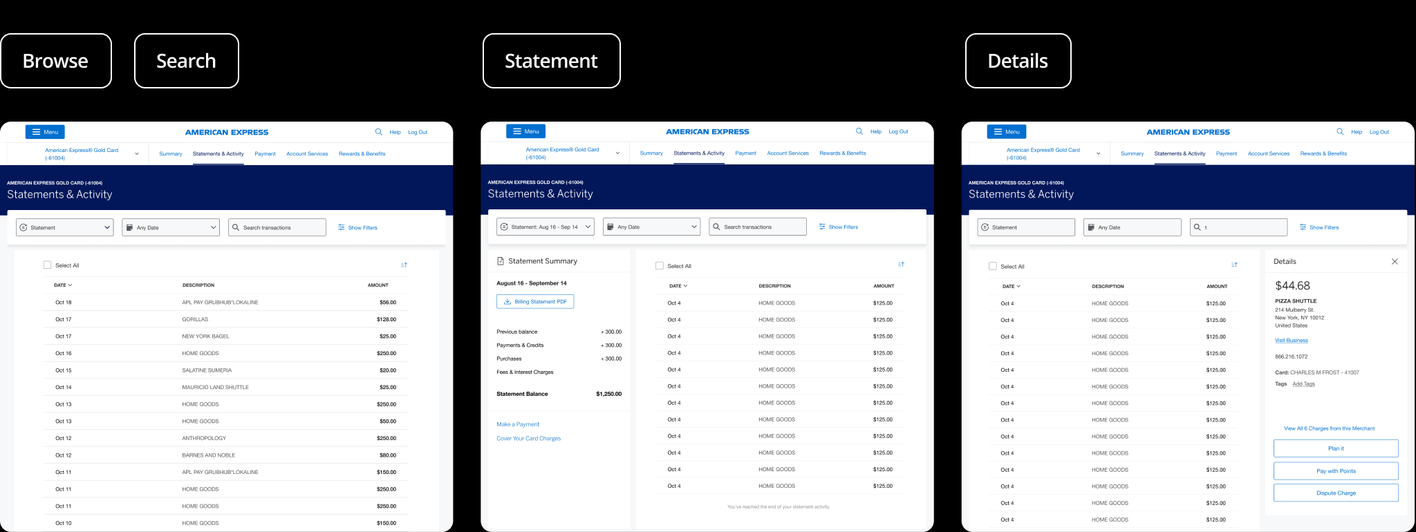
Step 2: Uplift Statement Balance + Consolidated Filter
Removed the statement breakpoint to reduce visual clutter and streamline the experience. Account balances were brought to the top of the page to meet user expectations and create a clearer starting point. We also consolidated filters into a single, scalable section to improve clarity and support future enhancements, ensuring the layout remains clean and adaptable as more features are introduced.

Step 2: Add Multi-Select Checkboxes for Print and Download
Reintroduced multi-select checkboxes to enable users to individually select transactions or perform batch actions like printing and downloading. This familiar pattern improves efficiency and brings back a key piece of functionality that many users relied on in the legacy experience.

21 Features
21 features in S&A delivered
600+ screens
All breakpoints XL - S & edge cases delivered
10+
Reusable components added to the library
Feature Hightlights
What's New
More Date Range Options
New Last 30 Days, Last 60 Days, Last 90 Days preset date ranges help you review your transactions. Research points to Customers thinking of transactions outside of cut off statement dates and more along the lines of "what have I spent in the last month?"
View Your Balance Summary
You get expanded details about your balance for each date period when you expand "View Summary". This consolidates the previous two different areas of balance details (vitals area on top and summary section on the bottom).
Download Your Documents
Easier way to find and download your statements, year-end summaries, and other files. This addresses the pain point of customers not being able to easily navigate to the billing statements page.
Outcome
27%+
Customer Visual Design Satisfaction
35%+
Statement Download Intent
19%+
Increased in View Transaction Details
.png)

